Showing posts with label museum review. Show all posts

Tate Liverpool’s new major summer exhibition Turner Monet Twombly: Later Paintings

JMW Turner, The Parting of Hero and Leander, exh1937, Tate, 2011

Art I saw Andrew Graham-Dixon this morning. The Culture Show frontman was leaning on the fencing at the Albert Dock in Liverpool gently chatting with a colleague/friend/who can guess and reader, I was star struck. Others are impressed when they see footballers, musicians and actors in the wild, but for me it’s arts presenters it seems (see also Mark Lawson), especially ones who’s programmes (BBC Four’s Art of here there and everywhere) have probably taught me large sections of what I know of the subject. As a rule, I don’t tend approach people I admire, it tends to be quite embarrassing, and I didn’t this time, because also apart from anything else the man was working.

Like me he was attending the press event for Tate Liverpool’s new major summer exhibition Turner Monet Twombly: Later Paintings. Though unlike me he was also interviewing Alexi Sayle for television. We’re instead making to with this. The third and final venue of the show’s tour (having previously visited Stockholm and Stuttgart), it’s a bit of a departure for this Tate which usually concerns itself with contemporary art and only rarely ventures chronologically before the twentieth century. Which isn’t to say that either Turner or Monet have little affinity within modern art circles. Both benefited from the growth of expressionism in the 1960s, especially Turner who pushed the landscape form into abstract areas.

At which point I should confess on first viewing, the very first walk around the exhibition, I didn’t “get” “it”. Never much of a fan of Turner, a huge fan of Monet, but never having even heard of Twombly, when asked by a press friend directly afterwards what I thought, I made a sound which spelt out probably looks like “ih”. On first inspection this seemed like a very good Monet exhibition constantly interrupted by Turners and Twomblys. Because objectively it is a very good Monet exhibition since for the first time in ten years it collects together five of his water lily paintings in close proximity, two of which haven’t been in this country before. There’s also Rouen Cathedral, a couple of his Waterloo Bridges and Matinee sur la Seine.


Claude Monet, The Water-Lily Pond (Le Bassin aux nymphéas) 1917-1919, Oil on canvas, 1000 x 2000 mm, Courtesy Albertina, Vienna

Not the chronology of the forming of that opinion is as linear as that paragraph suggests. I did notice that in the first exhibition space on the ground floor Turner’s The Parting of Hero and Leander is displayed directly opposite Twombly’s painting of the same name and that the overall shape of the latter, with its huge sweeping smudges of pink and white paint are informed by the overall structure of the former, both evoked in Monet’s nearby series Untitled (Porto Ercole), the often deadly elemental cocktail of earth, fire, wind and water. But I still found myself lingering over the Monets, his ability to capture the misty morning atmosphere of places I can only dream of visiting in stark contrast to the paradoxically, it seemed to me, the formal chaos of Turner's more familiar locations.

It wasn't until later, during a tour from curator Jeremy Lewison that I realised that of course my beloved Monet is being interrupted by Turner and Twombly, this is an exhibition which imagines a centuries long conversation between the three painters demonstrating that artists, for different, often very personal reasons, continually return to the same themes and techniques. When Turner paints Peace – Buriel At Sea to commemorate his friend painter David Wilkie who died from typhoid on the voyage back from Egypt, when Monet completes a series of Venetian paintings begun before his wife’s death and when Twombly is inspired by the funerary boats in Cairo Museum, they’re all wrestling in their own way with grief.

At which point, my “ih” became an “ooh” and it was almost as though the background chatter seeping into the space from other floors was the paintings themselves whispering their own points of view, and quite often in agreement with each other. In the Fire and Water section (the exhibition is thematically separated into seven sections) (plus a little shop) (I like a little shop) we see in Parliament, Burst of Sunlight, Monet attempting to show how the golden light of the sun bouncing across the Thames is refracted by the morning mist. He’s reacting to Turner’s own similar attempts and later Twombly (who included a Monet exhibition catalogue amongst his prized possession) continues the experiment.

Cy Twombly, Untitled 1987 (2), © Cy Twombly

In selecting works from the later periods, the curators, as the exhibition’s mini-guide explains, are capturing the moment when “the outward battles have been won” (presumably in relation to stylistic concerns) “but the inward battles commence”. The themes which connect these works have a funerial aspect. Of the three, Monet’s the artist with the clearest recognition of his mortality, losing his sight later in life which led to a much coarser approach to painting, the question being whether this necessary roughness as a result of his condition or a set of choices reflecting that condition.  Similarly, is the simplicity of Twombly's massive day-glo red and Camino Real series a result of his age?

But it has to be said, it’s Lewison’s talk which really helped to crystallise how these relationships work so I wonder if a visitor would be best not looking at the exhibition too closely at first and instead take the lift to the fourth floor and finding the small room in the middle of the exhibition space were the curator appears on video at one of the earlier vernues giving to camera what looks like a version of the same talk, about its inception as originally featuring Rothko until he noticed the closer connection between the current three, about his meeting with Twombly who explained that he owned letters from both the other artists which crystalised that connection and how the various themes developed and much more.

Only after that would I return to the ground floor and beginning with the Partings of Hero and Leander and work outwards. This is how I wished I’d approached the exhibition just as I wish I’d read this excellent piece by Michael Prodger from The Guardian which covers some of the same ground. But at least, though there isn’t much "least" about this, my appreciation of Turner has been irrevocably changed. I know now that he wasn’t some establishment figure, and that even in death, inscribing in his will that he wanted his unfinished works to be displayed with his finished paintings, he was directly confronting that establishment. As always happens when eavesdropping on the best conversation, I’ve learned something new.

Turner Monet Twombly: Later Paintings at Tate Liverpool opens on Friday and continues until 28th October.  £12 admission (concessions available).

an exhibition of Eleanor Fortescue-Brickdale's work


Art One of my favourite paintings, certainly in my top ten is The Forerunner, painted in 1920 by the artist Eleanor Fortescue-Brickdale (see above). It’s the Italian Renaissance and in an imagined moment, Leonardo da Vinci demonstrates a small prototype of one of his flying machines to his patrons Ludovico Sforza and Beatrice d' Este, the Duke and Duchess of Milan. The surrounding multitude with their mix of scepticism and indifference are beautifully realised as are the fashions with their elaborate patterns especially one female figure in a bright aquamarine dress.

There’s much more about the struggles between Leonardo and his patrons at the website of the Lady Lever Art Gallery where the painting is held and is also the venue for an exhibition of Eleanor Fortescue-Brickdale's work. She was one of the number of artists in the later waves of pre-Raphaelites, along with William Morris and Edward Burne-Jones, painting mythical, biblical and classical scenes in a relatively realistic form, the look which defines for many people Victorian painting (even if as is so often the case there was much more variety than that).

Fortescue-Brickdale has unfortunately remained relatively unknown, at least in comparison to John William Waterhouse (one of her influences), largely because she was working at a time when the pre-Raphaelite style was already falling out of fashion and it's a mark of the way that such things change that this the first show since a display at the Ashmolean in Oxford in 1972.  Also much of her work was in stained glass windows, book illustrations and small sculptures and is arguably often part of collections in which the star names receive the limited available wall space.

The exhibition is guest curated by Pamela Gerrish Nunn, Associate Professor in Art History at the School of Fine Arts, University of Canterbury, Christchurch, New Zealand and co-author of  Pre-Raphaelite Women Artists.  She spoke to Laura Davis of The Liverpool Post recently about the exhibition and says "when we look at Fortescue-Brickdale’s work, we can see it as one woman’s attempt to engage with the issues of the time, to make her own decisions about contributing to the making of contemporary culture.”

Some of her best work is in books, especially a portrait of Shakespeare’s heroine Sylvia (from The Two Gentlemen of Verona) in a collection of old English songs and ballads, rendered in a contemporary, almost photo-realistic style, the colour popping out of the pages (despite the necessary low light levels in the gallery space). There’s also a rare chance to see a number of paintings long since hidden in private collections like Vivien and Merlin showing the moment the elderly wizard is beguiled by this beautiful young thing, her serpent-like figure accentuated by an emerald green cloak.

Fortescue-Brickdale’s trick is to express some rather profound ideas through startling images. In Time the Physician, the artist overturns the idea of “father time” as one of death’s heralds with an illustration of him binding the head of a knight, suggesting instead time as a great healer.  Another jaw-dropping watercolour (which is worth visiting the exhibition for alone) is The Guardian Angel in which a celestial interventionist stretches her cupped hands around a World War I bomber, shielding the pilot on what might be his final journey, in what could as well be an alternative poster for Michael Powell & Emeric Pressburger's film A Matter of Life and Death.

She’s often described as the last of the pre-Raphaelites and the appearance of one the twentieth century’s first technological achievements rendered in the style and imaginary structure of a movement begun seventy years before also demonstrates that even as Fortescue-Brickdale ploughed on with her work, even she was recognising that it was part of a bygone era. By the 1920s she’d apparently abandoned the style but by then she’d created a valuable body of work which deserves greater attention, something this exhibition will hopefully provide.

[Image: © National Museums Liverpool.]

The Opinion Engine 2.0: 16/31:
Republic of the Moon at FACT.


Press view invite from FACT in Liverpool.

Art When was the last time you looked at the Moon? Properly looked at it? Walking around Republic of the Moon it occurred to me how much I took for granted one of the most extraordinary examples of natural beauty, one which is accessible to our wonder every evening no matter our geographic location (depending on weather conditions) and which as the work demonstrates is almost unique in its ability to inspire both those who comprehend it with their imagination and those who strive to measure its properties, artists and scientists.

It’s apt that Martin Scorsese’s Hugo is still playing at FACT's cinema (just about) with its flashback sequences showing the production of Meliere's Le Voyage dans la lune. Like him, these artists seek to investigate humanities motivation in choosing to go to the moon through fantastical elements and fictions. The gallery guide mentions the recent Mars 500 ‘wood panelled spacecraft’ in Moscow, six men simulating a space mission on the ground. Through another prism that would be performance art.

In Enter At Own Risk, 2011 We Colonised the Moon, Hagen Betzwiser and Sue Corke imagines the work of lunar scientists on the moon’s surface, specifically the smell generated by moon dust as they re-entered the lunar module. They’ve attempted a recreation, which to my nasal cavity is somewhat like the Yankee Candle shop but through scratch and sniff postcards has been confirmed by one of the actual astronauts. One of the repeated elements of the exhibition is the revealing of little known facts about our natural satellite.

Beyond an airlock which reminds us of the preparatory processes from FACT’s previous success, ZEE, a room is set out like a mock up of the lunar surface and visitors at the weekend will be able to see the artist’s own astronaut recreating a moon mission, gardening the artificial rocks. We received a preview and its an eerie experience not least because as a group we were awed into silence presumably so as not to distract the performer from their task. We met the person behind the mask later but I won’t spoil their anonymity.

The last Apollo landing was by the Soviet Union, when in 1976, the Lunik 24, an unmanned probe stopped off for twenty-four hours and collected moon rocks. Leonid Tishkov cherishes that fact and in Private Moon he personalises it by presenting a series of photos illustrating the story of man who meets the moon and decides to spend the rest of his life with it. These are beautiful evocations of the city, illuminated by the moon itself carried about like the heart in the promo for Rodger Sanchez’s Another Chance, a reference he probably wasn’t intending.

Similarly its unlikely Sharon Houkema had the rippling moon of the surface of the water in the opening titles of Arena, the BBC’s arts strand when producing M3, but as it ebbs and flows on the wall above us, it replicates the same broken quality in a clever adaptation of an overhead projector. As the accompanying text describes: “The moon image – often surrounded with mysticism, romanticism and fantasy – is rendered (un)intelligible, yet the magic doesn’t disappear, it merely switches position.”

The point were science and art properly coexist is in Andy Gracie’s Drosophila Titanus a small display which gathers evidence of the artist’s attempt to breed a fruit fly capable of withstanding the extreme conditions on Titan (Saturn’s moon) (which you already knew) (sorry to insult your intelligence). When Gracie says the experiment could take many thousands of generation it gains an epic quality even on discovering the life cycle of the fly is nine days. One of the outcomes will be in seeing how mutant strains and deformities can speed up the process.

Liliane Lijn imagined in 1992 a moment when she’d behold it and see the word printed across it in block capitals, the celestial body becoming a metaphor for the female body which it already effects indirectly. He decades long project has resulted in a video piece representing her vision which shifts every twenty-six hours in time with its actuality, the natural lunar cycle suggestion a gender transformation as SHE becomes HE and back again. In the darkness of the media lounge, moonememe is accompanied by the voice of Lijn and a friend vocalising these shifts.

If you take my advice you will visit the media lounge then Gallery Two first because for once it’s Gallery One (opposite the box office) which provides the grand finale and perhaps one of the most original, astonishing, exciting art pieces these thirty-seven year old eyes has seen, a work which taps directly into my whimsy gene with its poignancy. Glimpsing at it through a window on an exterior wall as I arrived for the press view suggested this would be a simple reproduction of the control room for a moon mission.  I was wrong.

At which point the title does much of the work. Agnes Meyer-Brandis’s The Moon Goose Analogue: Lunar Migration Bird Facility takes it inspiration from Francis Goodwin’s Jacobian utopian fantasy novel The Man in the Moone, which recounts the diary of one Domingo Gonsales who’s carried to the moon in a chariot by geese and the artist has bred eleven of the fowl at an analogue for the moon in Italy, the secret success being that instead of simply faking these elements, we’re seeing their behaviour live.

None of which really describes the excitement of being in the room, the attention to detail of some of the elements, and it’s not supposed to. You have to visit, even for ten minutes, even if you’re primarily in the building to go the movies (though chances are whatever you’re seeing will have a tenth of the imagination of this). It’s rare that I become quite so evangelic about an art piece but along with the accompanying film which charts the development of the experiment, Meyer-Brandis captures the magic of Melieres through even more dimensions than Hugo.  Breathtaking.

The Walker’s new exhibition [...] The Art Books of Henri Matisse

'The Art Books of Henri Matisse'

Art Yesterday I attended the press launch for The Walker’s new exhibition and the experience was literally, and to use a description they’ve been far too tasteful to put in the publicity materials, like walking into the pages of a book. The Art Books of Henri Matisse displays sixty three illustrations on leaves which were originally part of four volumes published between 1932 and 1950 during at the peak of the artist’s career. In a bit of a coup, they’re a loan from Bank of America Merill Lynch’s art collection as part of a kind of community outreach programme which has seen this exhibition tour and other major shows across the world. Here’s another one in Paris.

We begin with a short primer which includes the nugget that he only began painting at the age of twenty when his mother gave him a paint box. The wikipedia elaborates on this with the detail that he was convalescing after an attack of appendicitis and that it felt like “a kind of paradise”. Even though he was disappointing his father, he pressed ahead with becoming an artist and if the late photograph featured, by Cartier-Bresson of Matisse working at home, his room filled with doves flying loose is anything to go by, the lifestyle consumed him. He sits with his fist around the body of one of the poor birds, calmly sketching away.

A Matisse landscape from the Walker’s collection is also included, an impressionistic, a nondescript thing which demonstrates why he only really found fame at the turn of the last century when he began to follow fauvist ideas. These books are part of the onrush of work which developed from that as, like many artists of the period, he took advantage of printing technology to disseminate his material to a middle class audience greedy to demonstrate their cultural credentials but unable to afford his canvases. With the scarcity of paper and small print runs, these were apparently still much sought after and it’s the mission of the curatorial collaborators to convince us why.

Opposite the biography is a short display explaining the four main techniques Matisse employed in his work with examples of four printing plates: Linoleum (lino) is easy to cut and shape and offers nice clean lines, pochoir (stencil) which he used to create bold abstract shapes, etching on copper and lithograph, the results of which gave impression of crayon drawings. There’s also a display cabinet containing the tools which were required in these processes all of which were clearly very tactile but whose nature also must have informed Matisse’s artistic choices. Perhaps what makes him a “great” artist was his decision engine.

The bulk of the display is the four books themselves. Originally produced as loose leaves, they’re easily frameable but inevitably the gallery environment changes them and our experience of what Matisse was trying to achieve. These are not the complete books, so the sense of creative or narrative flow the artist would have built into them is lost, as are the juxtaposition of images from page to page, the symbolic repetition of colour. You’re also unable to contemplate them in quite the same way, especially if like me, you’re the kind of person who’s easily distracted from concentrating on anything by your fellow humans with their walking around and breathing.


 The Private View.

That accepted, it’s impossible not to enjoy the prints as individual objects, even Posesis de Stephane Mallarme from 1932, the most “book”-like of the four publications, in which Matisse’s creations are visually most separate from the text, each appearing on opposite pages. The press notes explain that Matisse was in Tahiti (see, the lifestyle) when his Swiss publisher Albert Skirta asked him to create etchings for this publication. Over the next year and half, and with his eye most interested in women and nature, he produced dozens of suggested drawings of which twenty-seven were eventually chosen.

Translating Mallarme’s poetry was a consideration at the planning stage for the show but it was ultimately decided that since the text is deliberately obscure, meta-physical, an English version would be too much of an interpretation and couldn’t ever reflect the sense. Interestingly, that’s generally what Matisse is attempting visually, translating the text through the prism of his own imagination. There are caricatures, of Edgar Allen Poe and Baudelare, but mainly we see the beginnings of some of the motifs which would reappear throughout his career, especially the abstract, cluttered group of naked females.

Next in the room, travelling in a clockwise direction, is Pasiphae, Chant de Minos (Les Cretois) from 1944, a joint project with the French author Henry de Montherlant in which Matisse illustrated a contemporary retelling of the origins of the Minotaur myth. Even without an inability to understand the text, the highlights of the narrative punch through in the drawings influenced by Greek vase paintings, King Minos defying Poseidon and refusing to sacrifice the white bull, his wife being put under a spell and to fall in love with the animal, their deed and the half man, half beast who was the product.

In the eight years since the Mallarme, his artistic confidence has also grown taking full advantage of being as much part of the publication process as the author by over seeing such details as producing lithographed designs for the opening capital letters. Some of the illustrations are initially difficult to distinguish forcing us to look ever closer until we realise that it’s a female form.  Pasiphae in-flagrante? Such was his poise that he was even capable of reducing a human form to a single line, as he did with one image of Minos, then imbuing it with great emotion, the king screaming, having realised what his wife has done.


Le Cheval, l'ecuyere, et le Clown (The Horse, the Rider, and the Clown)
© Succession H. Matisse / DACS 2011

Jazz (1947) show his ability and philosophy move another step on, as illustration and text become equal partners and though he was even less interested in having the subject matter match, aesthetically the effect was and is perfect. There’s no particular narrative to speak of, just a set of images experimenting with colour and stencilling, each a work of art which could be complete in and of itself more clearly than many of the other sheets in the exhibition which must be what makes them so immediately accessible. It includes one of Matisse’s most reproduced images, Icarus, floating in a royal blue night sky filled with golden stars, a red circle representing his destination.

This is a collection often as straightforward as cave paintings yet also infinitely complex because of the chosen colours, because of the shapes, which despite seeming haphazard and random have to have been deliberately designed due to the printing process.  A controlled hullabaloo. Plus after a series of images in the other books which have to be titled after part of the accompanying text because they lack their own, there’s something relatively comforting about returning to a world were titles less enigmatically reflect their content.  The Wolf.  Pierot’s Funeral.


Frontispiece From "Poemes de Charles D'orleans"
© Succession H. Matisse / DACS 2011

Produced concurrently with both of these was Poemes de Charles d’Orleans (1950) whose publication was saw the end of a nine year odyssey which began while he was bed-bound in occupied France. He was an admirer of d’Orleans's poetry and during three arduous years he created 54 full-colour lithographs to accompany the 15th-century text, which he also reproduced in his own hand, in a similar technique to Jazz though it's clear that for various reasons, Matisse wanted to venerate the text rather than distract from it, returning to the simpler shapes of his Stephane Mallarme work.

The result is nothing short of magnificent, drawing inspiration from illuminated manuscripts yet making them totally contemporary and they're just as fresh sixty years after publication. There’s a repetitive use of a green fleur-de-lys motif which evokes tapestries of the earlier period and 15th century portraits translated into line drawings, which again initially seem primitive and defy the laws of what a less forgiving teacher might consider well proportioned but could actually be different eras of art history touching.  Many of those old pictures were equally inconsistent about such things.

The exhibition ends with examples of artist books from the Walker’s collection, from photographer Edward Ruscha, Gilbert and George, Tom Philips and Jess Nutall. Tactile objects necessary held behind glass, they’re an excellent example of the difficulty of showing artist books and how much has been gained in taking the Matisse works out of their usual environment. You might even wonder what it would be like to display other books in this way, all of Pride and Prejudice or a Booker prize winner spread across a series of rooms forcing us to walk from one read page to the next, dozens of people reading the same book together.

Until 15th April 2012.  More details here.

[The Independent has a gallery of images from the exhibition].

exhausted children and their squalid living conditions


Fashion This afternoon I visited the International Slavery Museum at the Albert Dock for their new exhibition, White Gold: the true cost of cotton, which investigates the "abuse of labour rights in the cotton industry, primarily in Uzbekistan, one of the largest cotton exporters in the world".  As the exhibition partner Environmental Justice Foundation explains on their website, the country achieves its industriousness by making cotton picking a compulsory activity, with a third of the country's population indentured into farming the crop.  That includes children who from a young age are brought into the fields by teachers to work long hours with little food and essentially no pay. These are very much the conditions Dickens was highlighting a century ago in this country, still existing elsewhere in the modern world.

The exhibition itself is brief, filling just a small display area at the back of the museum and mostly consists of giant photographs of the children at work and an award winning film (which is embedded above for anyone who isn't in the area).  But nothing else is required.  The shots of empty classrooms, exhausted children and their squalid living conditions are more than enough for me to question the very clothes I'm walking around in, wondering where the cotton in my t-shirt has been sourced.  The problem is, as a flow diagram in the exhibition demonstrates, although the country of origin is still on the cotton when it is being traded, the yarn spinners source from a range of countries so by the time it reaches the shops and then us it is almost impossible for us to find out.

Tate Liverpool’s latest Magritte retrospective, The Pleasure Principle


Rene Magritte
Golconda 1953
The Menil Collection, Houston © Charly HERSCOVICI, Brussels – 2011


Art It’s 1992 and I’m at the Hayward Gallery on the South Bank during a school visit to London in which a class of us teenagers were dragged around the great art galleries of the capital by a very patient art teacher attempting awaken our appreciation of paint and canvas. I’m standing in front of Rene Magritte’s The Treachery of Images and as my brain explodes he’s clearly succeeded.

This is a painting of a pipe with writing underneath in French suggesting it isn’t a pipe. Well of course it isn’t a pipe. It’s a painting of a pipe. Yet it is still a picture of a pipe and if asked for an identification someone would be more likely to say “It’s a pipe” rather than “It’s a painting of a pipe” in much the same way that if asked we’d sat Mona Lisa was a woman rather than a painting of same.

For perhaps the first time, I think I properly understood the way that art hovers somewhere between truth, literal truth and lies and that one of the decisions most artists have to make is how to utilise these forces and the kind of connection they want to make with the viewer. Do they simply want to please them aesthetically or make them think or is it possible to do both?

A version of The Treachery of Images appears in Tate Liverpool’s latest Magritte retrospective, The Pleasure Principle, in the English translation accompanied by the connected works This is not an Apple and This is a Piece of Cheese which is all the more confusing because it’s still a painting of some Camembert on a small piece of canvas housed underneath a glass cheese dome.

Each time we think we understand Magritte's approach, his message, he does something contradicting any meaning the viewer might be trying to draw, confounding our expectations over and over again. But unlike Dali and other surrealists the images are so tantalisingly realistic, that we’re still constantly chasing that meaning like a transparent dangling carrot. Or in his case apple.

The Night Owl in the first room, a typical example. A coated figure, an embryonic version of his later suited man, stands in a restaurant like room with an empty table in the corner and in the middle, entirely unrelated to anything else is a lit steet lamp post. Immediately we begin to interpret, ask questions. Who is the man, why is the lamp there, why is the table empty?

A brain like mine filled with film narratives wonders if what we’re seeing is a man on his way home, separately shot footage of his memory superimposed on the scene as he remembers the restaurant. Was he stood up? Is that what the bare table symbolises or what that literally the scene? Or is he day dreaming about a restaurant he could soon be visiting. For that matter he could be a restaurant critic who’s endured a horrible meal?

Magritte has no answers and sometimes in paintings with titles like Clear Ideas and The Explanation, neither containing anything of the sort, he’s clearly teasing us. To an extent it’s his more surreal images denying any possible similar interpretation are “easier” to appreciate because we can simply enjoy the shapes and colours without attempting to apply conventional standards to the work.

Tate have displayed the work thematically rather than chronologically. The artist returned to the same graphics throughout his career and only in seeing all of these bowler hat men together can we really gauge how his attitude to the work changed across his life even if, much of the time, those are almost imperceptible and mostly to do with the quality of his painting.

The effect is repetitive. Apple after apple, egg after egg, sky after sky, the many bowler-hatted gentlemen. The bedposts with eyes skewered into the top. Alone, they’re very effective.  Together the experience is quite overwhelming. That’s a by-product of the academic need for comprehensiveness probably. I have much the same problem with Monet displays with their endless lily-pads.

It’s those canvases not containing these familiar elements that stick in my addled mind. The Delights of Landscape with its empty canvas labelled “paysage” (French for landscape) next to a shotgun. The Eye, a circular painting of an human’s ocular feature resembling a close-up of a peephole in a silent film. The Uncertainly Principle, a nude woman whose shadow is a bird of prey.

Which could suggest he didn’t have much time for women but famously as we're reminded by the Paul Simon song,  he had a long marriage with his wife Georgette and if the biography in the accompanying exhibition leaflet is anything to go by the artist was loved and his was not the life of a tortured soul and a man who was never out of work, as the film posters and other ephemera included here demonstrate.

The other surprise is the collection of photographs, a mix of candids of the Magrittes and friends in his studios and some attempts to replicate the ideas of his paintings. Watch out for The Feast of Stones (a perfect Doctor Who episode title) were he and his brother Paul and their friend Marcel pose in what looks like a building site pretending to chew on bricks.  Perhaps if he'd not been the painter he could have been a film comedian.

There are a couple of disappointments. Perhaps his most iconic image, Le Fils De L’Homme, the man with the apple for a face only appears on postcards and merchandise in the gift shop (the wikipedia says it’s privately owned) and I’ve always looked forward to the Tate’s audio guides.  For presumably good reasons that’s absent this time.  But that's more than made up for by the carpeted floor making the exhibition far cosier than usual.

For me the highlight of the show is, The Dominion of Light series, with its a cloudy blue sky over an atmospheric moonlit street scene which remind me of Rachel Louise Brown’s photographs at the Wolstenholme Creative Space during the Biennial this time last year.  She said she was attempting to “absorb, abstract and portray the psychology of artificiality”.

That's also perfectly describe Magritte work in general and these paintings in particular.  As anyone who’s tottered home at dusk in the moments when night turns to day and looked towards the sky and notice the stars have been replaced by clouds, it is, for want of a better phrase, a surreal experience. Which is propably why I like these. Out of all of the paintings in the exhibition, it’s one of the few occasions when Magritte's world and our own finally touch.

Until 16th October 2011.  Visitor details available here.  Press ticket supplied.

Eimer Birkbeck's Instantanes (Vladimir) at The Lost Soul and Stranger Service Station

Art The old Barber Shop on School Lane in Liverpool, now Lost Soul and Stranger Service Station art venue is currently (for another couple of days at least) hosting the latest sound installation by Eimer Birkbeck, a sound artist who’s previous seen her work heard at the Cornerhouse in Manchester and throughout the rest of the world. She attempts to document soundscapes and reproduce them in a gallery setting, and these two works, Vladimir is part of what she calls her Instantanes series (a web search doesn’t reveal other instances - I’d be intrigued to know what they are).

The space is split into two areas, sectioned off with cotton curtain. On the right we hear the taxi ride through an early morning blizzard of someone called Dimitri and in the other (where I used to get my hair cut) the midday bells from the ancient convent of Suzdal cry out. Both play at the same time, and the chimes intermingle with the rev of the engines; standing in front of the information table in the middle of the shop its not hard to imagine that you’re chasing through the streets past the church, especially with the natural bustle of Liverpool bleeding in from outside.

If the idea brings to mind Janet Cardiff’s Forty Part Motet in which that number of speakers are arranged about the white cube producing some Tallis polyphony or even a home cinema system, the execution is rather more rustic. The walls and floorboards of each room are filled with home made speakers cobbled together from found Russian wood and antique loudspeakers bought second hand which means that the resulting noise changes depending on where the listener is standing, which certainly works better with the hopeful beating of the bells.

One final technical note: both installations stopped just as I entered and as the invigilator lifted up the black wooden box at the heart of the work, I was amazed to discover an old Sony Playstation lying on top of an amplifier with a remote control converter sticking out of the front. Apparently they’re in widespread use in just this kind of art, because the sound chip inside is more flexible than that of an ordinary cd player and superior even to the later PS models. Which also meant I was able to hear the old Sony start-up jingle in greater clarity than ever before.

a sight we’re not privy to


Museums Regular readers of this column will know that I’m generally fairly circumspect when it comes to commenting the display policies of most of the museums I’ve visited. There's little point criticising a gallery with only a limited amount of space and varying regimes and ideas and I know how difficult it must be to hang a fine art collection to the best advantage and often hard to justify if there’s nothing by a verified a-lister that will have the crowd flocking. Better to give the space over to something that will have a definite attraction for visitors or can be linked to the educational syllabus. But too often they’re stuck in a stairwell and you frequently find yourself standing between two steps looking nearly vertically upwards at something which has been put near the ceiling, a health and safety concern as other visitors try and dodge past you on the way to the Egyptian gallery or some such.

Lancaster City Museum presents another challenge. A conversion of the Old Town Hall, it clearly wasn’t designed to display this kind of work so there it is mostly in the stairwell again. Except on one of the walls are two large windows and nearly all of the paintings are glazed. Which means that it’s impossible to view any of the work without some kind of light source getting in the way. The one painting Edward Morris reproduces in his Public Art Collections in North-West England is a Portrait of Mrs Fuller Maitland by W. Blake Richmond. She lounges in a couch with a book and fan wearing some top rank cuture. I would have liked to have waxed lyrical about the work, but you can’t even see it, as the sunlight beats in from the windows at either side of it, bouncing onto the paintings opposite, the edges of frames reflecting all over the front.

I have a better notion of what the painting looks like from the black and white image in the book than from being in the presence of the thing. But that was true of the whole visit; only a few of the paintings, prints or drawings are unaffected by some kind of light source, usually artificial in other places. I spent most of my time looking sideways at work because to try and view it from the front was to do so with a circular flash of light obscuring some part of it, usually the centre. Again, this is something which happens in most galleries, even Tate Liverpool. But it just seems much more acute at Lancaster and pretty much spoilt the visit. It’s difficult to enjoy a picture, and analyse what the artist was trying to achieve, if much of the effort is spent trying to see it in sections. Too often I had to look at one side then step across to the other, taking in visual information like the panning and scanning machine that used to be used on films in the VHS days.

So here's the best of what I could see: The museum moved into the town hall in 1923 having previously been housed in the Storey Institute which had been refurbished by local oilcloth and baize manufacturers of the same name. The collection was the usual selections of gifts – from the Storeys who purchased the work of local artists and from artists themselves who were enamoured with seeing their work on this site. In 1951, for example, Philip T. Gilchrist gave the museum his Xerces burning Athens a wonderfully cinematic injection in which the Greecian fleet is valiantly trying to stave off an invasion of overwhelming odds, a classical story played out in a pastel impressionism of Monet. W T Jackson’s All Quiet shows the British front line at Ypres during WW1, abstract flairs of light streaking into a monotone blue sky towards the haggard silhouette of the enemy.

In A Sunny Day, William Gunning King verdantly reminds us of a forgotten piece of England in which an Edwardian family step from a road into some woods in what looks for all the world like a shot from a 70s Sunday night BBC costume drama. Ary Scheffer’s tiny but perfectly drawn Annunciation of the Shepherds has a small group of the sore afraid looking in wonder towards a sight we’re not privy to, their eyes perfectly fixed on that point no matter where they’re positioned within the painting as though an invisible ray is flashing towards them. But the undoubted highlight of the collection is Max Gaisser’s The Conference which shows a group of bearded Jacobians around a table deep in conversation in front a bookcase filled with antiquated volumes, delicately painted and full of mystery. Who are these men? What are they talking about? Why is what looks like a cardinal standing in the shadows at the back like the Cigarette Smoking Man in The X-Files. Sadly there’s no information label with this work so perhaps I’ll never know.

The most intriguing part of the building is fairly unheralded and a legacy of the building’s past. On the first floor are two rooms; a display in (aptly) the old court room commemorating the work of the Lancaster army regiment and in the council chamber an exhibition relating the history of the town. About that in the corners between the wall and ceiling, partly obscured by the internal structure of the exhibit is a series of murals shows scenes from history, significant moments in the lives of monarchs interspersed with their coats of arms and seals, incredibly vibrant vignettes depicting the period covered by Shakespeare and beyond through to Queen Victoria. There’s no mention of them in the local history handbook on sale in the foyer, other than a photograph dating from 1890 and the attendant didn’t know anything about them. They’re very far away and dimly lit but with these layman’s eyes they reminded me of Edward Burne-Jones and are certainly something which could be made more of a feature of. They’re as impressive as the paintings in the collection, and in some cases moreso.

To be continued ...

the long night I’ve spent in Liverpool

Life Many is the long night I’ve spent in Liverpool, but last night was The Long Night (part of the Abandon Normal Devices festival) with dozens of arts venues across the city holding open their doors until late in the evening. It’s a fantastic idea, though with so much happening in such a short span, you’re always missing something and if you’re like me and don’t like to miss anything if can leave you in a bit of a daze or even worse looking like the Roman god Janus with a migraine. I think I might even have contracted a touch of Whitworths, that rare condition which leads me to insensibility during art gallery visits though as you'll read the fact that my sense were constantly assaulted didn't help. Stumbling about from venue to venue I think I somehow managing during the course of the night to give Robin the impression that I’m only really interested in free alcohol (I hardly ever drink) and mash part of somebody’s artwork (again I have to press the point, I hardly ever drink).

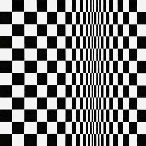
First stop The Walker and their new Bridget Riley show, Flashback. Riley is one of those artists whose work I admire without necessarily being a fan. This is artwork created using a set of principles, an initial idea taken through to fruition without deviation or improvisation. That takes some mental discipline and I do like the idea of Bridget Riley working doggedly in her studio against established expectations to create these geometric shapes, static images often filled with movement, but find them very hard to look at. It certainly was last night, her seminal Movement In Squares which looks like a chessboard being pulled into a singularity, making me feel like the primal William Hurt in Altered States. At least this show offers a variety of her work, from the cataract inducing Cataract series through to her signature Ecclesia, showing that she’s just as much about wavy lines as vertical lines of colour and that she’s still pursuing an ideal of colour representation even in her later work.

The Empire Theatre were offering tours, Natalie from the education department weaving a history of the building around an explanation of how, as a receiving venue, it manages to present such a variety of touring productions from Opera to Webber. The tour included fascinatingly complex explanation of the lighting system by the crew and some of the stage craft involved in modifying each show for the venue, noting that set designers aren’t always clued up on the need for flexibility, which explains why some productions can look a bit crushed or spare depending upon the size of the stage. Once again my perceptions were bent by this visually deceptive space. From the middle of the stalls the stage looks very large, but in fact the performance area is foreshortened, the space the actors have to move about far less than you’d expect. Plus the auditorium is actually partially underground, explaining why an audience of a couple of thousand can fit into an edifice which simply doesn’t look large enough from the outside. Insert Tardis related clichĂ© here.

At the Bluecoat is Under The Volcano, a group show responding to the work of Wirral born artist Malcolm Lowry. I will need to return to take a proper look, but my highlights so far are a room containing Cian Quale’s black and white home movie footage of the Isle of Man ferry unfolding from a human activated projector which brought back memories of a similar crossing I took as a child and Julian Cooper has three paintings from his Under The Volcano series illustrating scenes from Lowry’s semi-autobiographical novel. Local artists were selling their work in the courtyard outside. I bought a card featuring a rather fine line drawing of the Palm House in Sefton Park from Lianne Mellor, who I’ve promised to mention again when her website is up and running.

By now, I was flagging. Flagging so much in fact that I didn’t fancy the stairs within the exhibition space, but then couldn’t initially work the lift, whose control panel is about the most complicated that I’ve seen. It’s so complicated that they’ve actually included extra instructions on what to press:


Yes, I took photographs. Eventually I realised that you need to press button 2 to reach the “first” floor and button 4 to reach the “second” floor (and obviously G for ground). It’s to do with the vagaries of the building’s design – there is in fact a proper first and third floor, only accessible from the other end of the building, which this lift doesn’t stop at. They’re invisible here. It seems to me that it would be a lot less hassle (at least for the weary traveller) to simply replace the numbers on the buttons 2 and 4 with 1 and 2. It might not be architecturally accurate but it saves having to take the Krypton Factor mental challenge just to go up.

It’s at the Old Barbershop, at my old barbers in fact, next door, which is now The Lost Soul and Stranger Service Station that my foot inflicted the blow on the artwork, a paper design across the concrete floor which was partnered by a canvas piece on the wall. I stepped closer to scrutinise its geometric lines, didn’t look and down, and oh dear. The artist, Bernadette, was very gracious and not as cross as I might have been. We had a rather surprising discussion when I said her work reminded me of some of the works in Working With Nature: Traditional Thought in Contemporary Art from Korea which was at Tate Liverpool in 1992 (and I credit with developing my artist awareness which led me to getting my A-Level which meant I got to go to university first time around and well, everything in life is connected) and she said that she’s already had a very similar conversation with someone else. I’m still a vandal though.

Thence briefly to the Open Eye Gallery and their new exhibition from Duane Hopkins, Sunday. This features a series of videos of a disaffected youngster in various levels of repose, on a roundabout, looking into space, bored, who is then reflected across to the other side of the screen to create a mirror image sometimes interacting with himself, with each figure apparently in a time loop suggesting that there’s no escape from the existence they’re slotted into. Combined with the atonal music which permeates the space, despite the technicolour images it’s an especially melancholic piece and was difficult to spend too much time with. I’d imagine it’s a particularly difficult show to supervise the aural and visual assault difficult to take for too long, especially in the necessarily darkened space. But the intensity is important. It rattles the sense so that the visitor pays attention to what they’re seeing placing them right in the moment. As a filmmaker, Hopkins is aware of the tricks of the trade, how suture bonds the viewer to the image for the greatest effect.

The sensory overload continued in the Media Lounge at FACT which has been transformed into an epilepsy inducing three dimensional zoetrope in which what looks like tiny plastic Michael Jacksons dance before your very eyes. It’s the kind of surprising work with has been FACT’s hallmark during its twenty year history. Last night was the birthday party and though I missed the main thrust of the party, I did manage to grab a glass of champagne, and a cake from FACT’s Stuart who I met at the Twestival the other week. Outside in Arthouse Square is KMA's Stranger Attractors. Intelligent light is projected on the pavement which we can interact with creating new shapes which are then video projected onto the wall of FACT making us active participants in the artwork. At the end of the night as groggily I watched dancers spinning about the beams showing the pedestrians how its done (accompanied by a saxophonist), I decided that it been just the right kind of night, one there should be more of, that I should have even more of, a long night in Liverpool.

it’s often so passionless


Museums LS Lowry is an acquired taste, and it’s a taste I’ve never acquired. Living in the general area, Lowry’s name and work crops up over and over both in local galleries and particularly on the local news whenever an anniversary is reached, an exhibition is opening, one of his 'lost' paintings is found or Oasis have put out a new video and there’s the usual clip of Brian & Michael (or rather Kevin & Michael) on Top of the Pops, shots of the real place the artist was trying to capture and then the work itself with its muted colour and naĂŻve figures; social history through the prism of splodges and lines and dirt. The worst indictment possible is to say that it’s pleasant – it’s not art which stirs my emotions positively or negatively (which is the best kind of art surely?) but simply exists waiting for me to stand before it and shrug my shoulders and sigh.

The shapeless forms of the people doesn’t help; he’s said: "I wanted to paint myself into what absorbed me [...] Natural figures would have broken the spell of it, so I made my figures half unreal.” There are other artists that have followed the same pattern, but you’re desperate for Lowry create an emotional connection, one which is apparent to everyone and not just those who lived through those hardships and those places and their descendants. But he continues: “To say the truth, I was not thinking very much about the people. I did not care for them in the way a social reformer does. They are part of a private beauty that haunted me. I loved them and the houses in the same way: as part of a vision.” Which is probably why, considering his subject matter often included extreme poverty, the blitz and proper human emotion, it’s often so passionless.

Yet he has a huge following, huge enough that after decades of acquiring his work, Salford City Council opened The Lowry centre as part of the Salford Quays project in 2000 as a way of celebrating his contribution to the local area (and you thought this was just a random rant about an artist!). It’s an exhilarating design by James Stirling and Michael Wilford with a giant glass atrium for an entrance, sweeping curves that give the impression of a ship and waves influenced by the surrounding waterways and as Edward Morris notes in his Public Art Collections in North-West England, “in the tradition of the Barbican Arts Centre in London” has, as well as a theatre, shops and a very nice (if a bit expensive) cafĂ© and restaurant. It’s the kind of place that used to only happen in the south which would be looked at with envy from the north and shows that high end arts venues can literally be built anywhere these days.

The Lowry, then, is an exciting yet comfortable building -- and a complete failure as an art gallery commemorating the work of a famous local son. Given that his name is stamped on the front, just four or five small white box rooms are dedicated to displaying the artist’s work, less floor space than the cafĂ© or perhaps the toilets and the adjoining waiting area for the theatre. Given my opinion of the man’s work, I shouldn’t be too annoyed about this – the idea of room upon room of the work to stroll through would fill me with dread – but in these circumstances, after the amazing architecture leading up this meagre haul, it’s still an anti-climax, especially having specially travelled in from Liverpool. I thought all of this when I first visited in 2002 and nothing has changed.

Exhibitions should be stories or in the best cases arguments explaining why the work on offer is noteworthy and notable and I was genuinely hoping that this time I might stand before some of these works and finally understand what they were trying to say, why they touch people. What counts against this happening here isn’t just the fact that so few works are on display but also that they’re displayed at what looks like random; some of the finest shows place the work into a chronological order so that you can see the artist’s ideas and technique develop reaching their zenith and then in some cases decline. At The Lowry the work doesn’t even seem to have been collected thematically. Instead, decades are mashed together and sometimes has the effect of actively arguing against his brilliance as works from the 20s are shown next to works from the 50s and nothing has apparently changed at all.

I say sometimes, because one of the gallery's few successes is to demonstrate that Brian and Michael did the artist some disservice; he didn’t simply paint the matchstick men and the rest, the stereotypical images of factory workers and dark Salford concrete, his range was much great taking in the rural landscape, maritime and portraiture. There’s a portrait of Ann, a fictional character around whom he’d weave stories for his friends, and for all its art deco stylings jet black hair and off-red top she has more humanity than anyone else Lowry painted. There’s an early image of Wigan’s industrial landscape that’s musty and impressionistic and show signs of the artist still getting his ideas straight.

The biggest surprise are his natural landscapes, which reduce what might be the lake district to a simple arrangement of shapes, olive greens, blacks and off whites so abstract that if they were hung on their side or upside down, without a label, they’d pass easily as something far more muscular. All of these were created concurrently with his more familiar work, and give impression that he was a man who wanted to try other things, develop his art, but was forever locked into a cycle of fulfilling popular expectation, presumably because it’s this that paid the rent. When he says he himself didn't want to give to layer some deeper meaning into this work, was it because he didn’t care much for it?

Perhaps I’m reading too much into this, unable to bypass my own deep seated prejudices. Throughout the gallery there are labels with quotes from previous visitors offering their opinions of the work, why they like them. There are celebrities (Les Dennis likes one of the houses because it reminds him of the place he lived growing up in Liverpool), but the more insightful comments are from younlings, the best from a child who finally understood the horror of the blitz from seeing Lowry’s depiction.

Maybe that’s the best time to view these works, when you haven’t already absorbed some of the other things art and culture have in general, the darkness, desperation and structure that can make you irritable, cynical and sad, so that you can look back on them with a certain nostalgia. But then, I’m not sure at that age I’d be able to view the major stand out piece in this exhibition, and still be able to sleep at night, Tollhouse on the Moor (1959), which, with its simplistic, symmetrical background and forbidding central building, which has all of the welcoming qualities of the Bates Motel.

unable to get my bearings

Art On Tuesday I visited the Whitworth Art Gallery in Manchester.

It’s the first time I’ve been to that end of the city since I left university in 2006. Walking up Oxford Road from the station, I remembered Graduation Day, standing outside the main hall in my gown and mortar board waiting to go in and meet Anna Ford. Seeing the name of my course base, the various buildings where I attended lectures and seminars, I felt, well alright, I felt like I’d come home. I hadn’t realised how much I missed the place, even though I hadn’t lived there, just commuted. It was more to do with the person I was within those buildings, learning, working towards something. It would be nice to have that back some time.

Past the university and into the precinct beyond and into the Gemini CafĂ© for lunch. I’ve been told this cafĂ© is world famous, and I suppose it must be considering how many international students have drifted through the doors. It is as you’d expect – 60s brown rigged tables and chairs bolted to the floor, surrounding a giant kitchen dishing out everything from pizza to carrot cake. The first and only other time I ate there was in the first week, with a group of people from my faculty, when friendships were being made and I realised that, because I wasn’t living there, it wouldn’t really be with me (and so it turned out). I was adventurous and ordered a fry-up. Having skipped breakfast, I devoured the bacon and sausage, wondered why they’d put the fried egg onto the plate upside down. I also drank a large mug of black coffee.

Which is where the trouble started.

I don’t know if it’s my age, but my caffeine tolerance has collapsed. I’m drinking tea as I write this and feeling a little bit tingly. This was, a strong, sterrrong cup of coffee. Stronger even than the kind I make at home using my cheap Argos filter coffee maker. Rich, full of flavour and totally toxic.

By the time I entered the gallery, I was why-errd.

Strolling up the road to the gallery which isn’t that far away from the cafĂ©, I felt perfectly fine, but as I stumbled up stairs into the foyer, I could sense something was wrong and by the time I was inside, reality seemed to have disassociated itself. I wasn’t high, at least I don’t think so. It was more in the region of being wide awake and half asleep both at the same time. I knew what I wanted to do, absorbed everything that was happening in my surroundings, functional, able to think about my ‘condition’ but not in a position to do anything about it. I could tell that I must have had an aura by the wide-eyed, slightly scared look the girl working in the shop gave me as I shuffled in looking for change for the lockers so that I could store my coat and bag. It’s impossible to describe any of this without sounding melodramatic or unlikely, but when you’re talking to yourself and having to think whole seconds before asking someone a question and these aren’t your normal modes of behaviour, you know that something has gone wrong, and there’s nothing to do but enjoy the experience.

According to Edward Morris’s book, Public Art Collections In North West England, as with the Lady Lever in Port Sunlight, the gallery is named for its patron Sir Joseph Whitworth, a local engineer famous for standardising the design of screw threads and revolutionising the making of gun barrels. When he died in 1887, Whitworth left his technology and art collections to the city on the understanding that they built some architecture in which to house them to do some public good. The council wanted nothing to do with it, more interested in building some architecture for their own collections, which left the status of the estate in jeopardy. Still, land was bought and the Trustees commissioned the present building, and by 1908, Manchester had a second gallery for the public. Bequests flooded in from throughout the country, but as is often the case, funding dried up and eventually in 1958, the University of Manchester (which had nicely filled up the rest of the local area) acquired the place, remodelled the interior, and developed its new dual purpose as public art space and teaching tool.

The shift in architectural styles certainly didn’t help my condition. The exterior, designed by JW & J Beaumont, is of the style you’d expect from that period, all columns, red brick and neo-gothic styling. The interior, apart from some structural holdovers at the entrance, looks like it was copied from the rejected design for the lair of a 60s Bond villain, with modernist wood panelling throughout, apart from an extension in which mixes a white box aesthetic with the original back wall, its now salmon coloured brick as much a feature as the paintings hung nearby. It’s the kind of mishmash I love in an art gallery, where part of the excitement is simply wondering where a doorway, stairs or corridor will take you next, and what treasures will be there. I’ve visited before, but my caffeine confusion and generally poor memory meant I only had a hazy notion as to where everything was and the display policy didn’t help either.

Like Oldham Museum, so that the Whitworth can give a fair presentation of its collection within its relatively small display space, instead of a permanent display, it has a rolling programme of themed exhibitions. Even though they have a rather extraordinary collection which includes works by Turner, Watts, Picasso, Blake, Riley, Moore, Hepworth, Hockney and Lanyon, they’re not all on display at the same time. Not only does this mean that the less well known perhaps but just as interesting parts of the collection are revealed, it’s audience can never be bored because there’s always something new to see. Later on in the visit, I saw a rather wonderful collection of prints and drawings by Walter Crane who defined the iconography of the union movement; a show of works paintings by Lynn Hershman Leeson and monoprints by Tracey Emin and ‘Putting on the Glitz’ a display of outrageous wallpaper in primary colours and gold leaf and art deco narratives pulled from the walls of old hotels.

Initially unable to get my bearings, I decided to begin with the main reason for my visit (other than ticking the gallery off the list), the touring Subversive Spaces exhibition which I’ve already mentioned on the blog and in particular the new installation from Gregor Schneider, Kinderzimmer. As the publicity describes, the artist has taken the usually sunlit South Gallery and “attempted to create a replica of a nursery that was part of a village demolished to make way for an opencast mine near where the artist lives in the Rhineland.” It’s a popular work. Visitors are only allowed to enter the space on their own and are handed raffle tickets with an appointed time on them in order to gain entrance.

When I ambled up to entrance at about a quarter to twelve I was told that all of the tickets had gone until 2:30. But I persisted, assuming that someone would surely forget to turn up and the invigilator luckily realised that because the school group which had block booked ahead of me had left early I could go in right then. He warned me that it was very dark inside, that it wasn’t for everyone and that if I felt uncomfortable, I should shout and he’d be in with a torch. I thanked him and shook his hand. To recap, I’m on a caffeine buzz, feel like my heads about to explode and I’m about to be deprived of one of my more useful senses. And I shook his hand. I’m a firm believer that even art galleries and especially installations can be spoilt, so if you’re intending to visit, I’d stop reading here for a couple of paragraphs so you can experience it for yourself.

As for the rest of you: just past the small tunnel that led from the entrance I found myself staring into a void. Schneider has somehow managed to create a space that feels completely safe and dangerous at the same time, rendering a sighted person blind even though their eyes are wide open, unable to see anything, not even their own body. Just about. Slowly as I edged forward, involuntarily giggling and say ‘Oh my god’ over and over under my breath like a cheerleader being chased through the woods by a slasher in a slasher film, I noticed a rectangular light ahead. Edging closer I realised it was a door. Not knowing if it was the exit, I looked about for some other light and noticed some shading to the left. Walking towards it, I realised it was the reflection of a window onto the wall.

Through the window is a brightly lit room, the nursery presumably, covered in pink wallpaper. It is sparse except for a mattress on the floor and the kind of place you’d expected to be locked in if you were being forced to go cold turkey for an addiction to something stronger than coffee. I could see the door and decided I wanted to go inside. Picking my way backwards, my hand out at right angles stroking the wall, which was covered in black felt presumably for safety, I realised Schneider’s design circumvents our normal perception of space and that the entrance to the room to the window had been shortened by the lack of light; I’d walked further than I thought, which meant that I might not be looking at one room. When I reached the door and entered, it was completely empty. The mattress had gone. There were two rooms. “Wow.” Suitably impressed and knowing that my time was at an end, I made my way, as safely as I could, to the exit, where another invigilator was waiting to usher in the next victim.

The mistake? That was my first exhibit. The rest of the visit happened after I’d had my perception shot to pieces and somewhere between that, the caffeine and the nagging mood of nostalgia the rest of the visit was somewhat wasted on me. Despite my best intentions, I couldn’t latch onto anything, blundering around hazily in a daze knowing that I was in now in no condition to appreciate my environment. The last thing I needed to see at that moment was something like Calin Dan’s Sample City video which features the artist strolling about a city with a door strapped to his back or Anna Gaskell’s dissonant photographs of contortionists seemingly deceased on the floor of a stately home. Elsewhere in the gallery I stood for ages trying to focus on Ian Stephenson’s Screen Painting I, an insane example of pointillism, which looks like the kind of work a child might make if they could glue hundreds and thousands to a canvas or what might happen if you could shake a George Seurat painting like a magnetic beard game and watch the figures and landscape merge into one.

I was perfectly fine about ten minutes after leaving the gallery, at exactly the moment I misjudged crossing the road and was nearly run over by a bus. I did consider returning, but decided I needed to put some distance between me and that room in terms of distance and between me and the gallery in time. I certainly won’t wait two years to return, but at least until there’s some new exhibitions. I’ve already made a list of things I’ll need to do to survive: be as awake as possible, get a bus up Oxford Road and definitely not drink any coffee beforehand. Or at all, ever again. Well, maybe sometimes, but certainly not before entering a darkened room. Unless it’s my bedroom. Isn’t life complicated?

I gaped. I sat down on a bench and gaped some more.


Museums About six months ago, though it seems longer, I visited Blackburn Museum and Art Gallery. I suspect this is the longest time between visit and review ever in the history of writing reviews, or at the very least on this blog and I have no excuse other than that I actually thought I’d already talked about it before. Then, some time in November I realised I hadn’t and Christmas descended and here we are. New readers might want to look here for the back story.

There’s a good chance that some of the information I’m putting to screen now is horrendously out of date, but museums don’t change that much I don’t think, so it’s at least worth describing the experience. Which luckily, was vivid enough that I can still remember (almost) everything. The main permanent collection area is upstairs and set away from the rest of the museum. With the exception of cleaners and handlers using the goods lift which is part of the room, I was alone for much of the visit.

Which was very helpful, because the first thing I did upon entering the room was the burst out laughing, a big loud, haughty belly laugh of the kind which is usually only provoked by, well, nothing. It’s because I was clutching a copy of Edward Morris's Public Art Collections in North West England, and on the wall in front of me was the painting from the cover, The Loves of the Winds and the Seasons by Albert Moore. As ever, the photograph doesn’t do it justice, the colours rendered pastel on the cover popping out more vividly in real life.

Once I’d calmed down, I decided to put it to one side for a moment and take in the rest of the gallery. I gaped. I sat down on a bench and gaped some more. Having been on a fair few of these visits, I’ve generally come to know what to expect, from these regional galleries. There’ll always been something really extraordinary, some nice works and the rubbish. This is a room which I think would shame some of the nationals. It's a visual feast.

Every image is majestic, and I don’t have enough time to take it all in. I’ve also joked before about how these galleries, should you unkindly want to survey them, could be ranked based on how many pages of notes I write. At Blackburn I ended up with six large pages and the handwriting of the younger version of me shows signs of scrabbling to get my excitement down on paper. There are some words I can’t even make out.

It wasn’t until 1870 that Blackburn decided to purpose build a library and museum, having previously only offered a wing of the town hall to put some books in. Designed by London architects Woodzell and Colcutt and built at a cost of over eight thousand pounds, the style is Gothic. The collection itself is the usual amalgam of purchases and bequests though the council thought it important enough that by the early 1890s they’d added to the existing building with this upper floor added for what they described as ‘The New Art Gallery’ and after the installation of electric lights, the gallery was able to stay open until 10pm each evening. If only that was the case now.

Rather than offering proper information plaques, the gallery have supplied a black folder with information related to the work. Some of this doesn’t quite match. Above the door, there are three portraits by Hilary Coddington Lewis, her husband Richard and their son Thomas. Collected together they offer something akin to a family portrait and she’s the image of contentment, reading, and the impression is of the comfortable silence in company that’s often a feature of the best relationships. The folder simply offers a biography of him – a cotton trader and philanthropist – but I wanted to know more about her – how she gained her skills, what led her to produce such work.

Two sea themed canvases dominate the rest of that wall. The liberal brushwork Henry Moore’s Rough Weather in the Mediterranean creates a three dimensional vision of an imposing aquamarine sea crashing about as a ship falls into difficulty in the distance, an elemental drama with an inevitable, tragic conclusion. When I was at school I remember seeing an illustration of what the surface of Pluto looks like, cold and isolated and that’s also what Julius Olsson’s The Reef is reminiscent of, with its distant moon and the only indication of human life being a small blob of yellow paint on the horizon denoting a lighthouse, the men inside seemingly alone in the night as waves crash against the surrounding rocks.

Rather less nihilistic is E A Hurnell’s The End of the Butterfly Chase. A couple of pre-teens have finally captured a red admiral which one holds tentatively as the other brings in the net. They’re playing in the artist’s garden. As the accompanying information described, “Hurnell and his sister had a house backing onto the beach at Kirkcudbright. Since the people of the village liked and respected the artist, they often allowed their children to be painted by him.” Paint has been applied to the canvas using a pallet knife and brush, the thick layers giving the violets and greenery a lightly abstract quality. The artist was apparently influenced by the decorative aspects of Japanese art.

It’s always a bit redundant to describe large paintings filled with people in classical dress epic, but in the case of Edwin Long’s Diana or Christ, there’s little choice. Straight out of DeMille’s 1916 film Intolerance, this offers a cast of thousands in mid shot most ready to pounce should the poor young woman, a rich Christian, decide not to offer a sacrifice to the goddess Diana, against her own religious conviction. There’s some impressive experimentation with the depth of field, with a Roman coliseum and forum in the background but the real interest is in the collection of serving girls to the left all of whom look to have variations of Diana’s face as though to suggest they’re interchangeable somehow, all the same (though that could also be because the artist has used drawings of the same model as guides over and over).

Next, there’s the Albert Moore (pictured above). In his book, Edward Morris is very pleased with this, dedicating a whole page and of course the cover. He quotes a poem Moore wrote to put his ideas for the painting into words, the depiction of the courtship of four male winds with four female seasons. But as Edward ponders: “It is not clear why Summer, the female figure on the left watching the courtship of the South Wind and Autumn should have been abandoned, not what the (presumably) much less enticing Winter should have the North and East Winds quarrelling over her in a patch of snow under dark clouds in the right background.”

I’m not sure what to think; I appreciate the skill of the artist, the particularly in the flowers. But the figures are uncomfortable in the space and a bit vacant. The reason I love the Pre-Raphaelites is that even in the most stylistic or symbolic of works, there’s always a light in their eyes, a trace of humanity. Moore’s painting lacks that and though I appreciate the approach, there’s a lack of warmth to the work, no sense of young love. I suppose I agree with the quote provided at the gallery from Sidney Colvin on all of Moore's work: “The subject, whatever subject is chosen, is merely a mechanism for getting beautiful people into beautiful situations.” Sounds like Mtv.

So I continue walking, continue to take everything in. Stanley Corshiter’s Roberta features a woman, her hair in a Louise Brooks style, against a black background, in a pose which reminds me of a fashion photograph, including the slightly startled look in her eye from a flash bulb. Adreotti’s The Music Lesson in which two aristocratic ladies are being taught to sing by a spectacled gentleman, painted with minute brushstrokes that pick out the floral designs in their dresses. Charles Dixon’s The Battle of Juttad, an exciting documentation of the battle with the fire of war, the sea blasting into the air, as abstract as the bridge scene in Apocalypse Now.

The rest of the permanent art collection can be found in the stairwell, though its mainly animal pictures which aren’t really my thing. I could be flippant and put it down to my cat hair allergy, but I expect it's because I have an affinity for the narrative and the unusual and the profile of a horse doesn’t seem to have that. Though there is a very good painting of two lions in repose, A Siesta by G. Nastagh, the male and female dozing, shaded by a rock and looking as unthreatening as the king and queen of the jungle could ever be.

At which point, I turned around realised how much more there was to see. There's room housing something called the Hart Collection. Inside there's a selection of Japanese art, including The Great Wave, and costume. There's also, without doubt, one of the best print collections I’ve ever seen. At this point, my notes become almost completely illegible and mostly a list, but I can make out four names, Gutenberg and Caxton, Morris and Burne-Jones.

A William Morris edition of the Works of Chaucer and the Well at the World’s End illustrated by Edward Burne Jones. Even in these line drawings I see the life missing from the Moore, though because of the way they’re displayed, only two pages can be seen which is a bit of the tease. I wonder in my notes if a reproduction could not be produced for browsing and study.

Blackburn Museum and Art Gallery also actually has a leaf from Gutenberg’s Mainz Bible of 1455, which is exciting enough. But it also has an original 1495 manuscript of St. Jerome Bis Patrum from The Lives of Saints by Wynkun de Worde of Westminster which the accompanying information says was completed by William Caxton himself on the last day of his life. He printed this and then a couple hours later, he was dead. I took a step backwards at that. I might have said the ‘No!’ word rather loudly, and people may have looked.

There’s earlier than that. How about a messenger tablet from Lagesh, Babylon in the third dynasty of Ur c.2,2000 BC? Well, alright, this grand sounding document is a shopping list, but still it’s a piece of history and since this ancient shopper was sending out for beer, bread and oil – it just prove that even in Babylon everyone knew what I found out when I was a drinker -- that the best remedy after a night on the tiles (literally in their case) is a fry-up.

I’m being frivolous, but this Hart Collection just underscores why I’m doing this and why I should begin again very soon. If I’d hunted through their website, I might have found out about these treats and that might have led to some expectation. But there’s nothing better than a surprise, moments in which the works of masters almost appear before your eyes, items which you didn’t ever think you’d have a chance to see. Amazing.

or is it three?


Liverpool Biennial 2008 Here then is the biannual Liverpool Biennial review. The theme for 2008’s International show is Made-Up which of course has the double meaning – the scouse term for being happy and the actual process of creating a piece of art. Artistic Director Lewis Biggs says it’s also “a celebration of the ways in which artists use imagination” and that he wanting to bring work which doesn’t just “traffic in information” but allows the artists to show their deep seated passion for what they do, and create something “totally new”. What is definitely new is that this definite structure has lent a coherence to proceedings so that everything feels unified and properly curated rather the individual venues doing their own thing under the Biennial banner.

So unlike previous years were the work has spread across the city and even with the help of leaflets it was difficult to get a fix on everything, this year a proper guide book come catalogue has been produced with an excellent clear map in the back and all of the different venues and public pieces placed on a trail, marked in pink and clearly signposted in the real world. I walked the trail today and it was a breeze if a bit of a slog by foot, the only times when I got lost having more to do with my lack of sense of direction than deficiencies in the map.

Unifying all of the venues in the one guide too means that even in the unofficial venues, information about the work is close at hand, the page on the right offering an excellent reproduction of each piece, and on the left a carefully judged explanation. Plus it's small enough to fit in the span of the hand and tactile enough to be flicked through. I quite enjoyed walking into each venue, guide in hand, the art lover's equivalent of a sword and shield, ready to do battle with whatever conceptualism the artist wanted to throw at me.

A new visitor centre has been installed at the old ABC cinema on Lime Street and though the Annette Messager piece in the old screen two (or is it three?) is interesting (a meditation on time and cinema with ghostly cloth flowing across seats and a sinister skeleton). There's a shop for refreshments and merchandise. Putting the Biennial’s embassy in such a central position is a great choice, somehow giving it a prominence lacking in previous years. It's also an excellent chance to enter the building for the first time since it closed ten years ago (has it really been that long?) and tut at the state its in.

Memories of seeing It's A Wonderful Life for the first time on the big screen and not wanting to see it on the small screen ever. Going on an almost date (neither of us seemed sure if it was one) to see Smilla's Feeling For Snow with a girl called Theresa who was on crutches after she'd fallen off a bollard one night when I was walking her home from night class. Spending most of The Lost World: Jurassic Park with a small child kicking me in the back trying to hear the thing over the din of the family sitting in front of me making sure they were all getting the same share of popcorn. Good times.

Next time: Art in public places